Ola Electric
Dark Mode

At-A-Glance
At-A-Glance
The Ola Electric companion app serves as the primary interface for our e-scooter users, offering features from vehicle management to ride analytics. As the lead UI designer for both the original light mode and this dark mode redesign, I recognised an opportunity to enhance user experience and modernise our visual language. Our user research revealed a strong demand for a dark theme, particularly for nighttime usage. This project aimed to not only implement a visually appealing dark mode but also to refresh the overall design, improving usability and aligning with current design trends.
The Ola Electric companion app serves as the primary interface for our e-scooter users, offering features from vehicle management to ride analytics. As the lead UI designer for both the original light mode and this dark mode redesign, I recognised an opportunity to enhance user experience and modernise our visual language. Our user research revealed a strong demand for a dark theme, particularly for nighttime usage. This project aimed to not only implement a visually appealing dark mode but also to refresh the overall design, improving usability and aligning with current design trends.
Ola Electric
Dark Mode
Team Project
Team Project
Sabu CV.
Sanket G.
Raghavendra ST.
Sabu CV.
Sanket G.
Raghavendra ST.
Role
Role
Product Designer
Visual Designer
Product Designer
Visual Designer
Tools
Tools
Figma
Cinema4D
Figma
Cinema4D
Timeline
Timeline
Nov 2022 - March 2023
Nov 2022 - March 2023
The Problem
The Problem
Eye strain
Battery Drain
UI Refresh
Maintaining Brand Identity
OLED Screen Burn
Eye strain
Battery Drain
UI Refresh
Maintaining Brand Identity
OLED Screen Burn
“How might we create a visually appealing dark mode for the Ola Electric app that minimizes eye strain and battery drain, while maintaining brand identity and ensuring accessibility?”
“How might we create a visually appealing dark mode for the Ola Electric app that minimizes eye strain and battery drain, while maintaining brand identity and ensuring accessibility?”
There was a growing user demand for a dark mode option. Our user research indicated that many customers were using the app in low-light conditions, especially at night before or after rides. The bright interface was causing eye strain and battery drain on OLED devices. Additionally, we saw an opportunity to refresh the app's visual design to align with evolving design trends and user expectations.
Key Challenges:
Maintaining brand identity while optimizing for dark backgrounds
Ensuring accessibility and readability across all screens
Seamlessly integrating new design elements with existing functionality
Coordinating with cross-functional teams to ensure consistent implementation
The Solution
The Solution
Palette Optimization
Accessibility Enhancement
Visual Redesign
Performance Optimisation
Comprehensive UI Redesign:
Palette Optimization
Accessibility Enhancement
Visual Redesign
Performance Optimisation
Comprehensive UI Redesign:
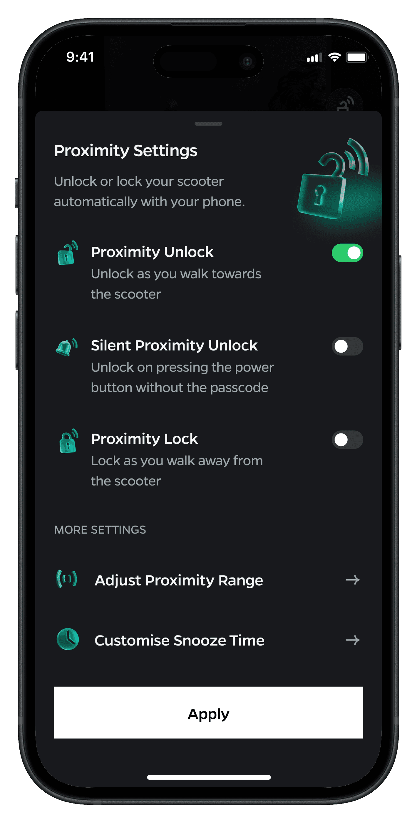
To address these issues, I spearheaded a comprehensive visual redesign effort to create an intuitive and visually appealing dark mode for the Ola Electric app. This involved a multi-faceted approach that touched every aspect of the app's design. Our goal was not just to invert colors, but to reimagine the entire user experience for low-light environments while maintaining the app's functionality and brand identity. We began by conducting extensive user research to understand pain points and preferences in nighttime app usage. This informed our design decisions as we crafted a dark theme that would reduce eye strain, improve battery life, and enhance overall usability. The process required a delicate balance between aesthetics, technical constraints, and user needs, pushing our team to innovate in areas of color theory, accessibility, and interaction design.
To address these issues, I spearheaded a comprehensive visual redesign effort to create an intuitive and visually appealing dark mode for the Ola Electric app. This involved a multi-faceted approach that touched every aspect of the app's design. Our goal was not just to invert colors, but to reimagine the entire user experience for low-light environments while maintaining the app's functionality and brand identity. We began by conducting extensive user research to understand pain points and preferences in nighttime app usage. This informed our design decisions as we crafted a dark theme that would reduce eye strain, improve battery life, and enhance overall usability. The process required a delicate balance between aesthetics, technical constraints, and user needs, pushing our team to innovate in areas of color theory, accessibility, and interaction design.
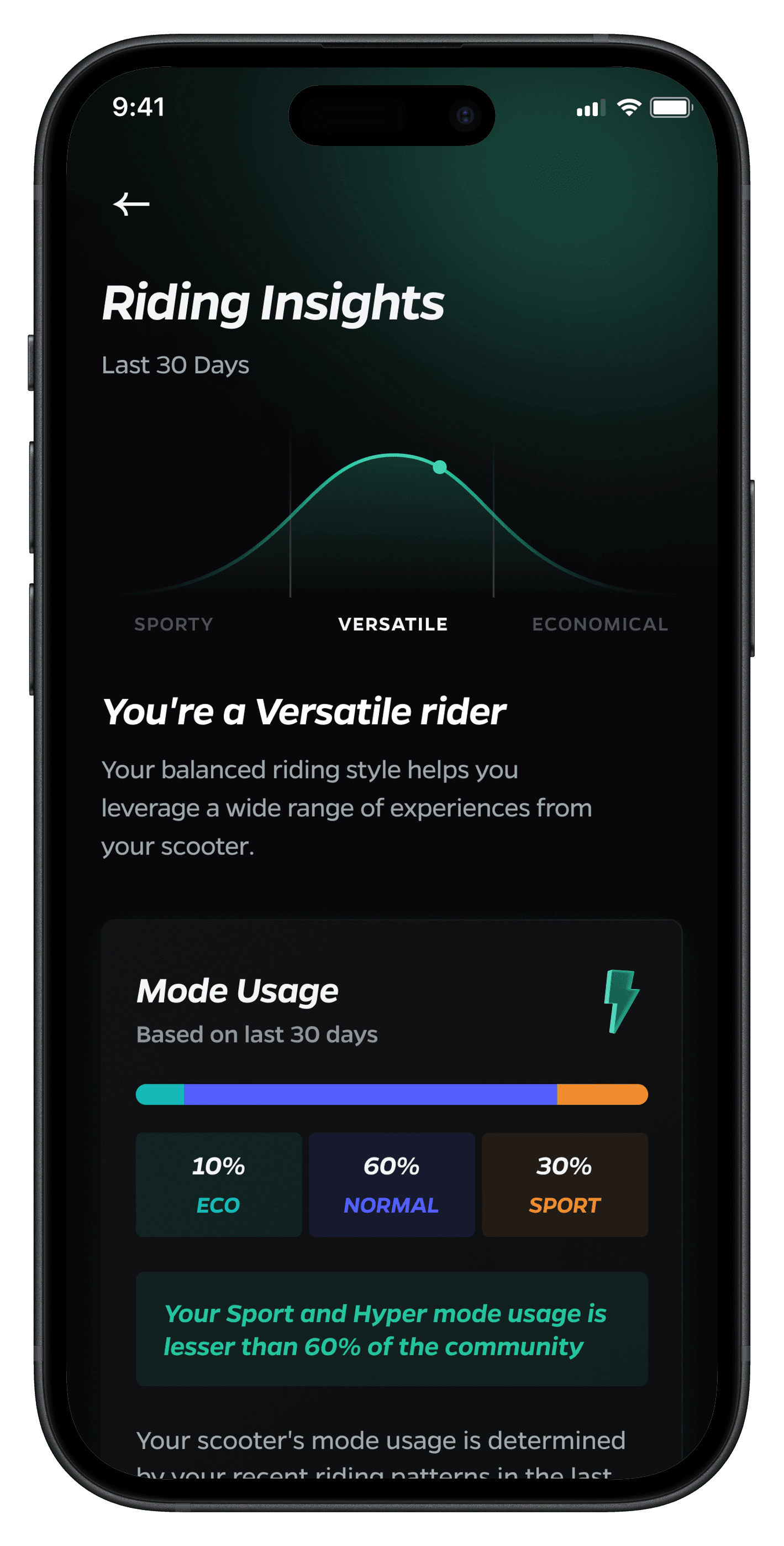
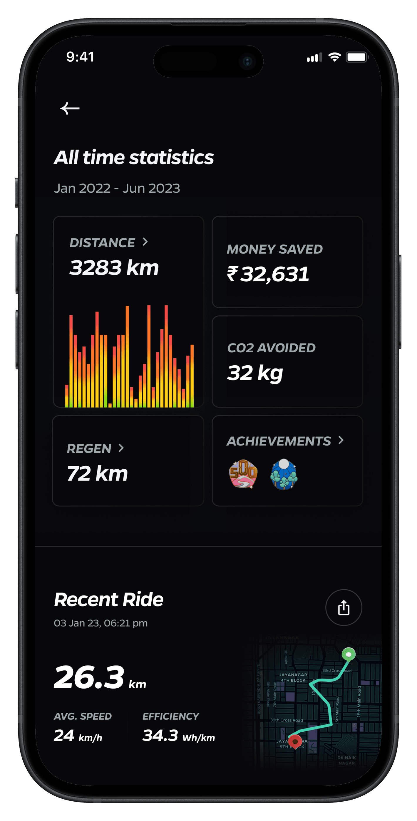
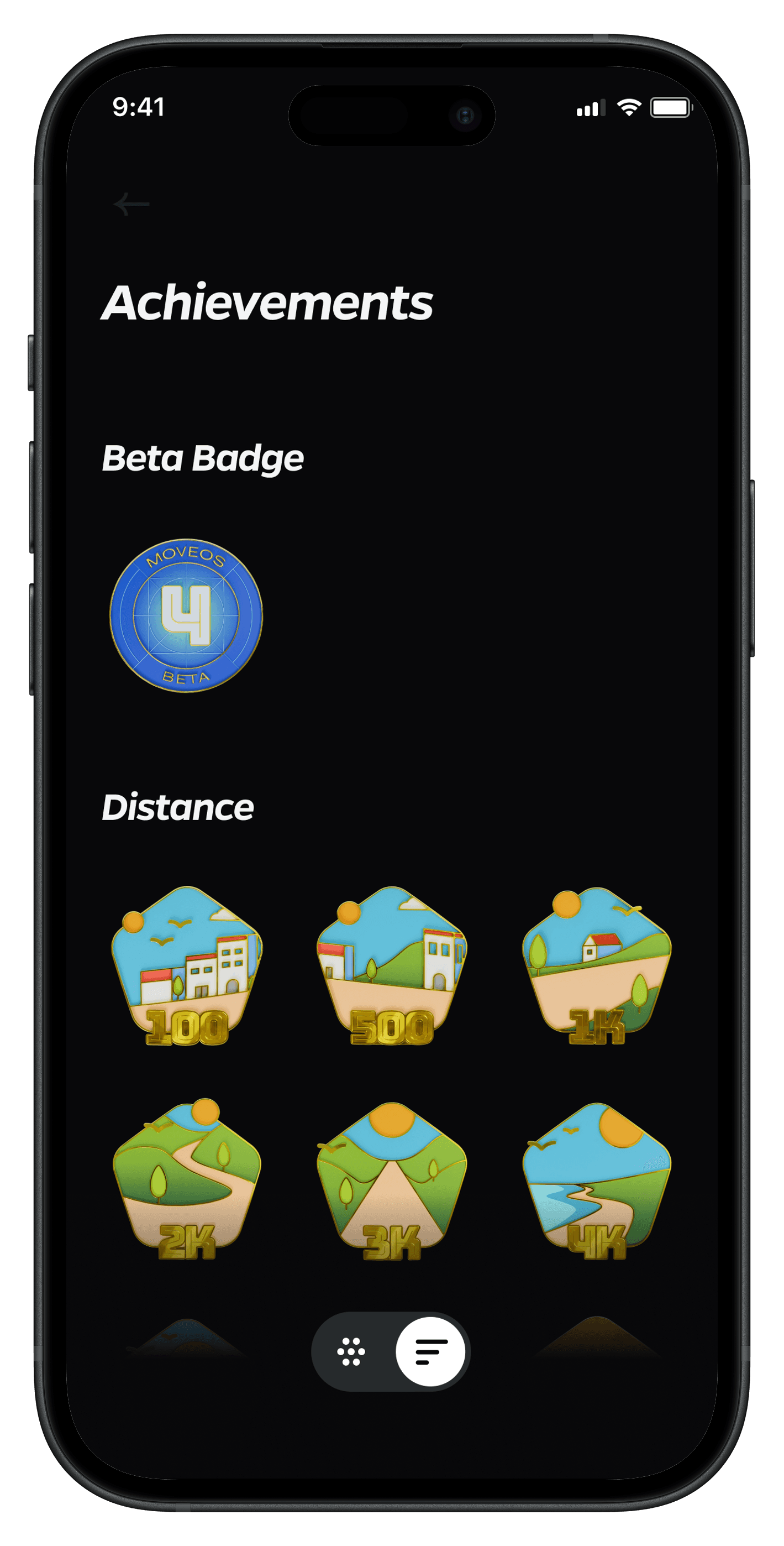
We developed an in-depth ride analytics system that gamifies the process of feature discovery and usage while providing valuable insights to users. The solution included :
We developed an in-depth ride analytics system that gamifies the process of feature discovery and usage while providing valuable insights to users. The solution included :
Color Palette Optimization:
Color Palette Optimization:
Developed a dark-optimized palette that reduced eye strain while maintaining brand consistency.
Developed a dark-optimized palette that reduced eye strain while maintaining brand consistency.
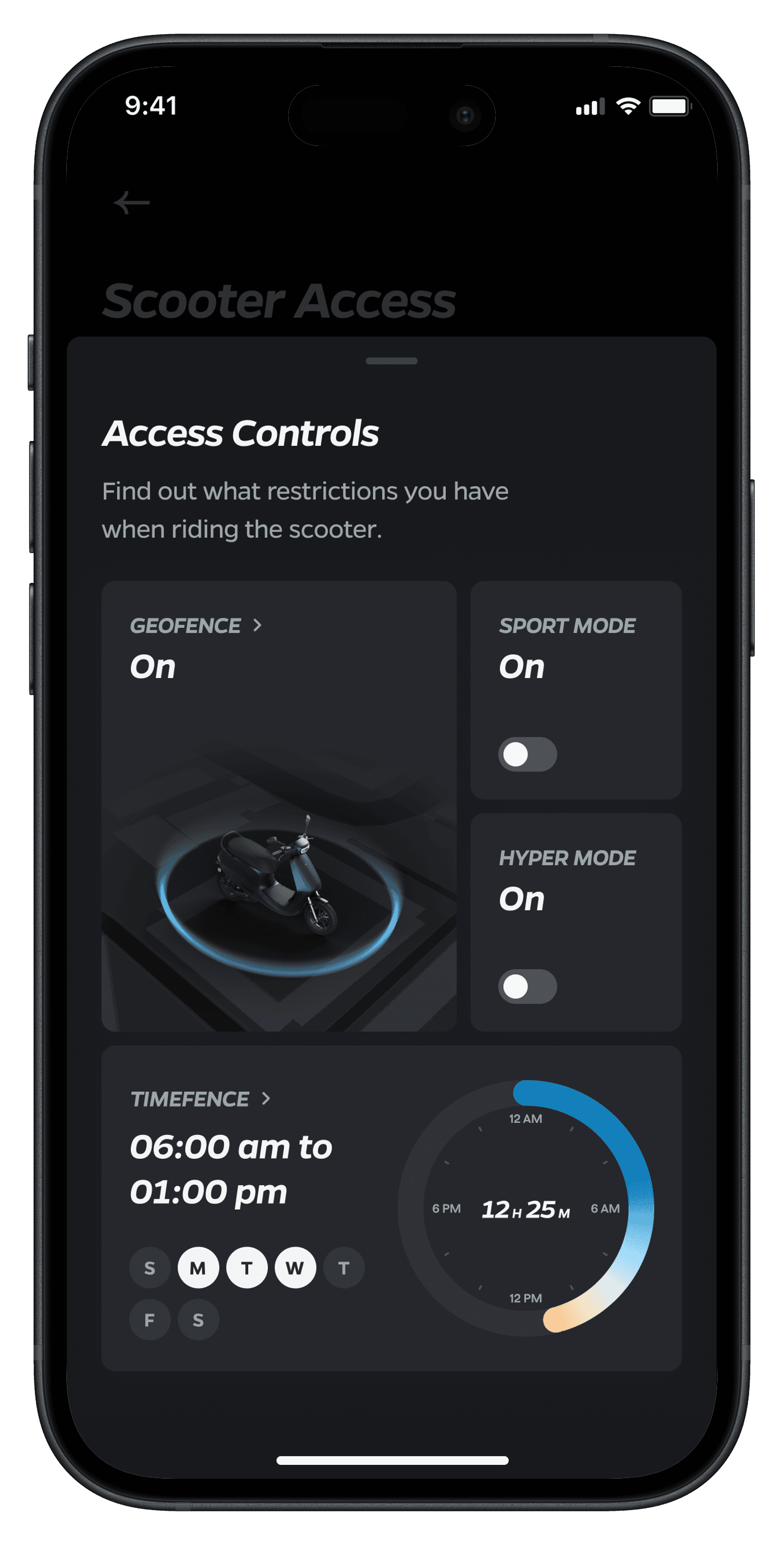
Comprehensive UI Redesign:
Comprehensive UI Redesign:
Reimagined UI elements, icons, and feedcards to function seamlessly in both light and dark contexts.
Rebuilt the 3D UI interactions to match the new User Interface
Reimagined UI elements, icons, and feedcards to function seamlessly in both light and dark contexts.
Rebuilt the 3D UI interactions to match the new User Interface
Accessibility Enhancement:
Accessibility Enhancement:
Ensured proper contrast ratios and legibility across screens
Special attention to text and interactive elements like feedcard animations.
Ensured proper contrast ratios and legibility across screens
Special attention to text and interactive elements like feedcard animations.
Design System Evolution:
Design System Evolution:
Developed a dark-optimized design system that reduced eye strain while maintaining brand consistency.
Developed a dark-optimized design system that reduced eye strain while maintaining brand consistency.
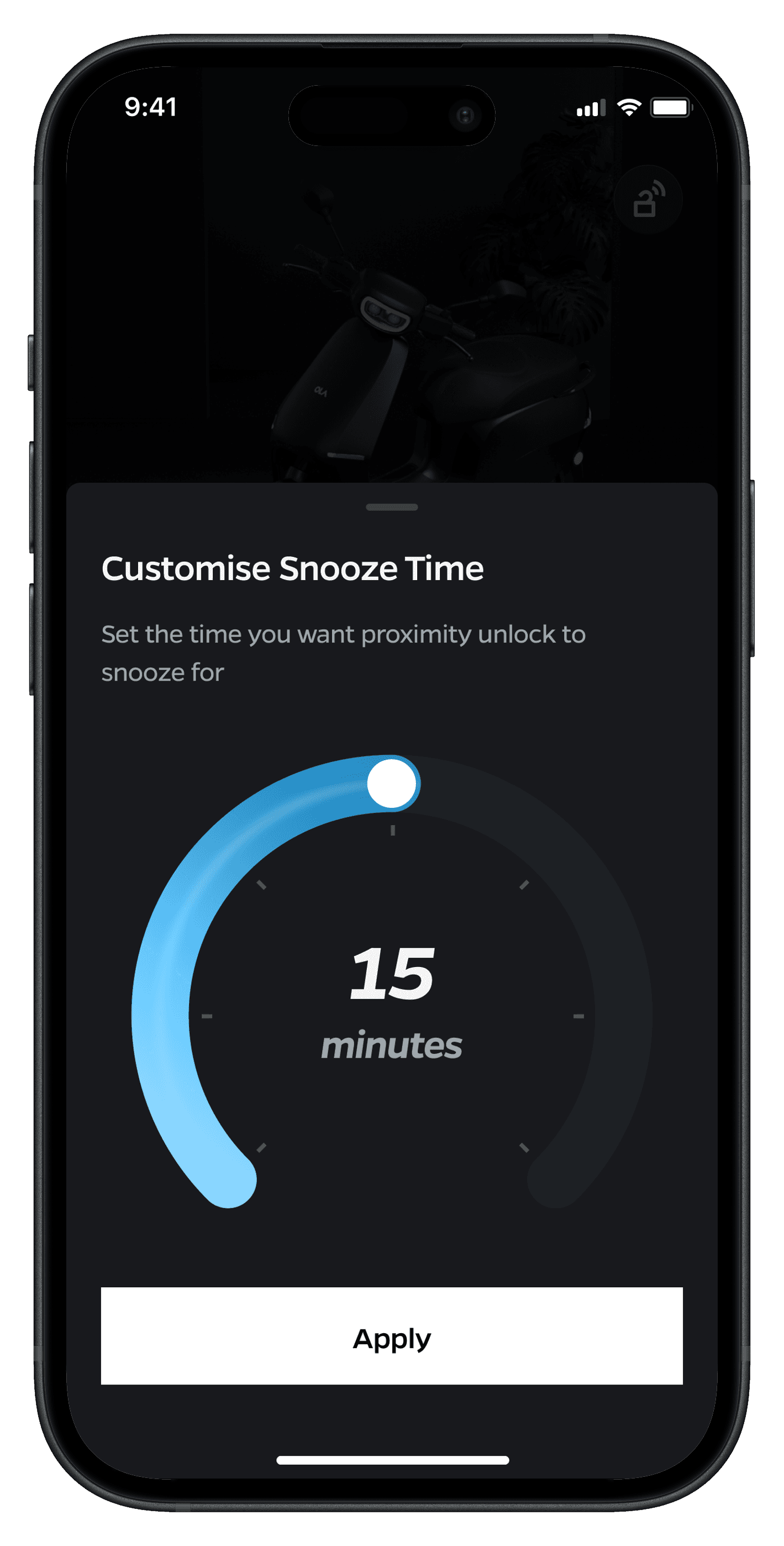
Performance Optimisation
Performance Optimisation
Optimised animations and transitions for a more fluid experience.
Optimised animations and transitions for a more fluid experience.
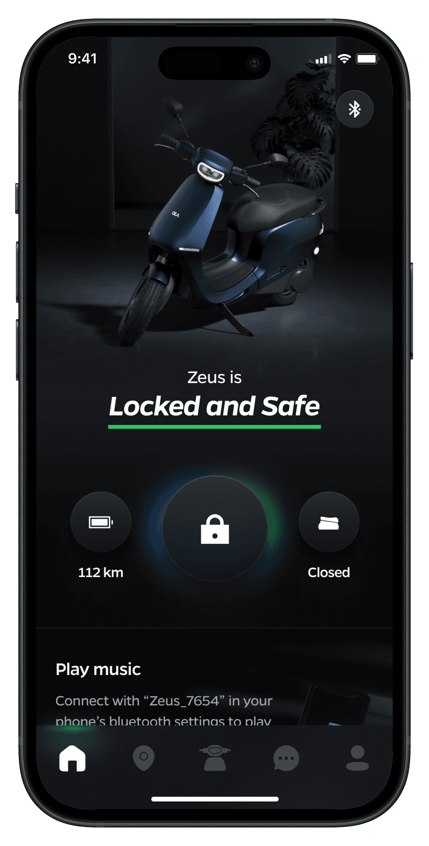
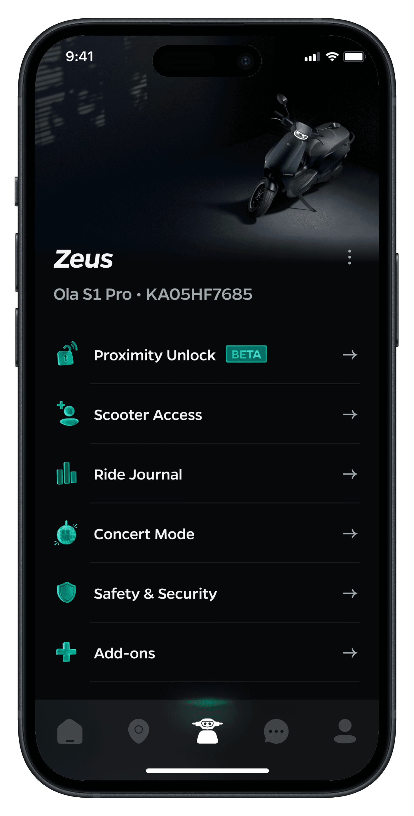
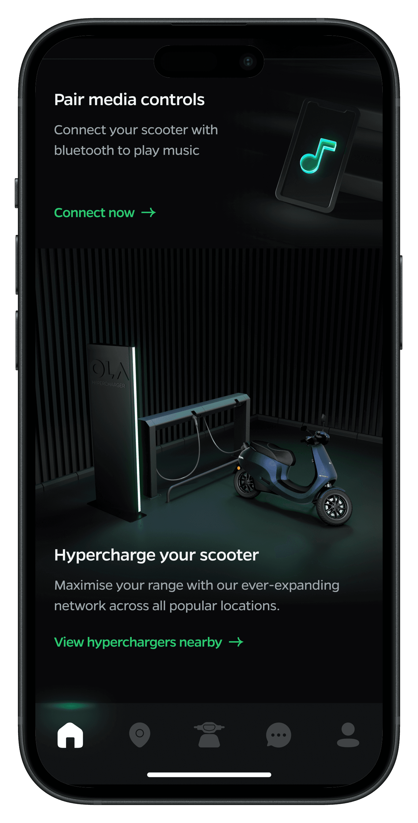
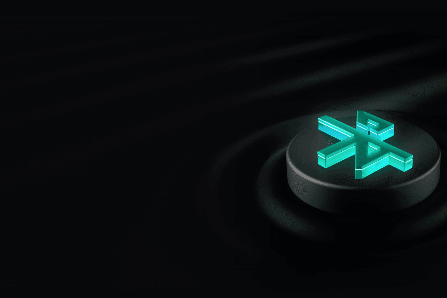
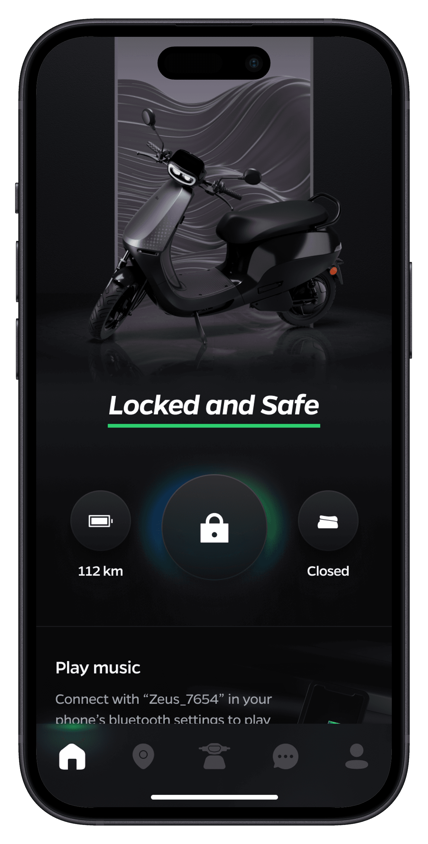
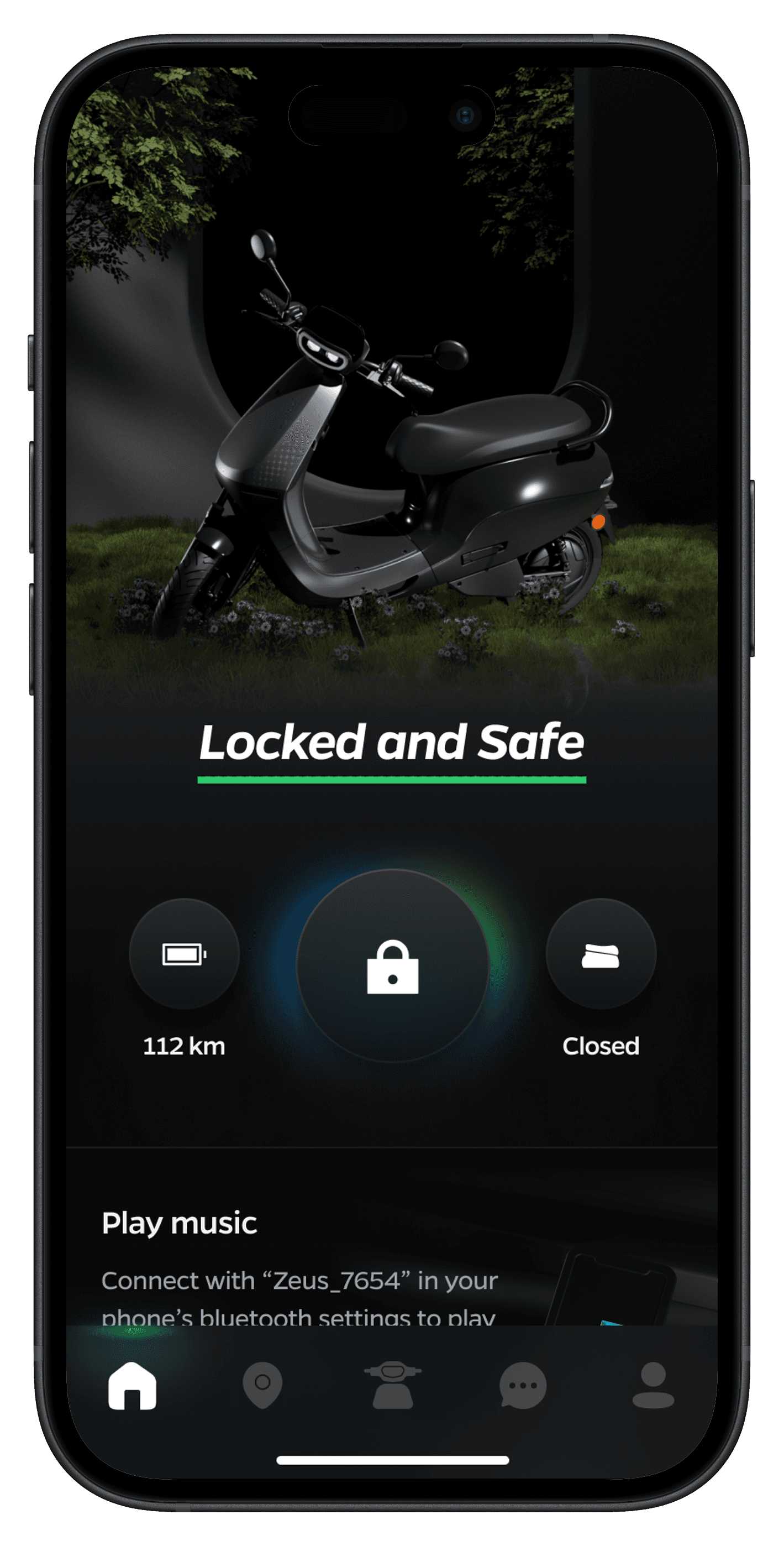
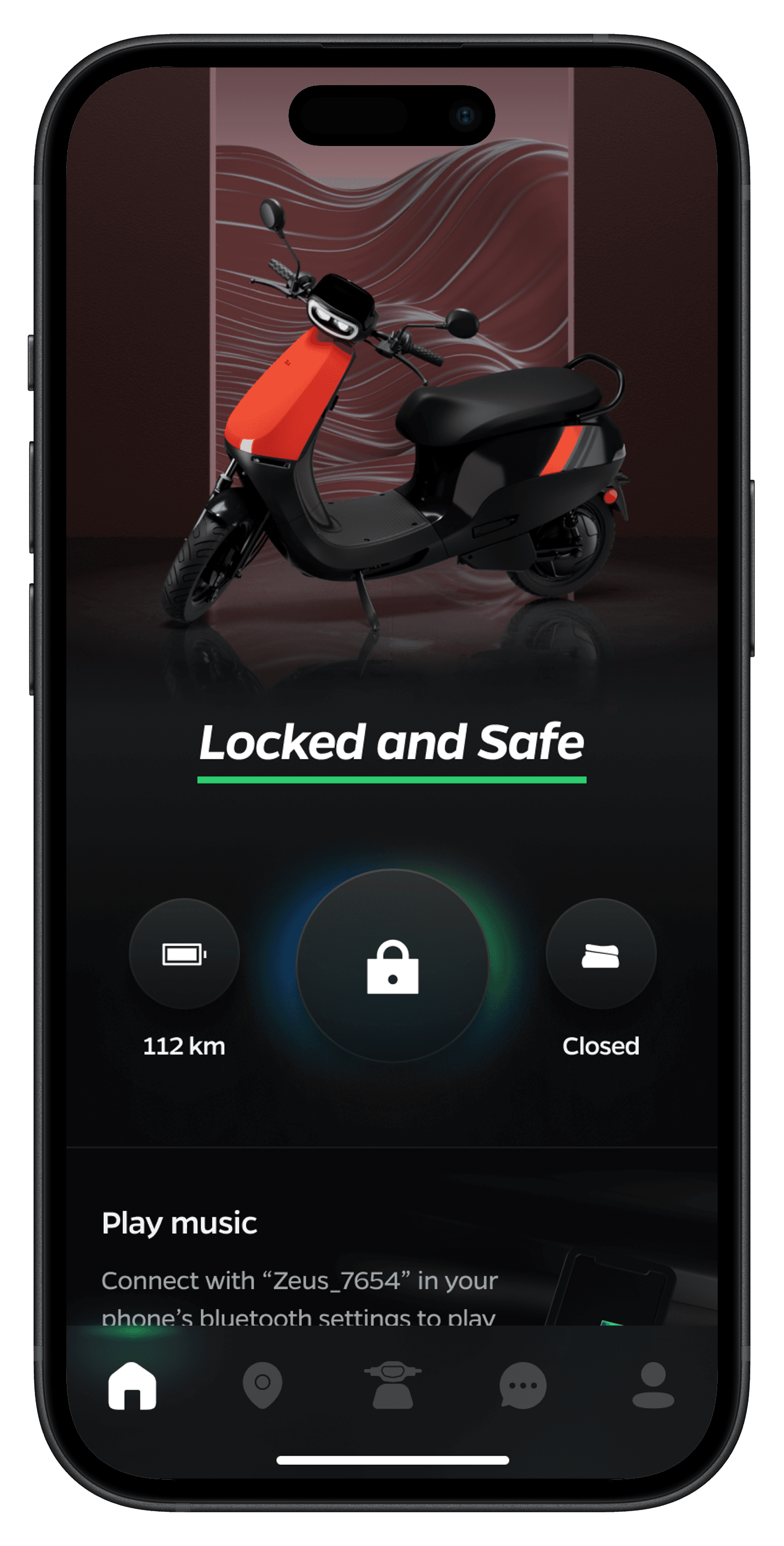
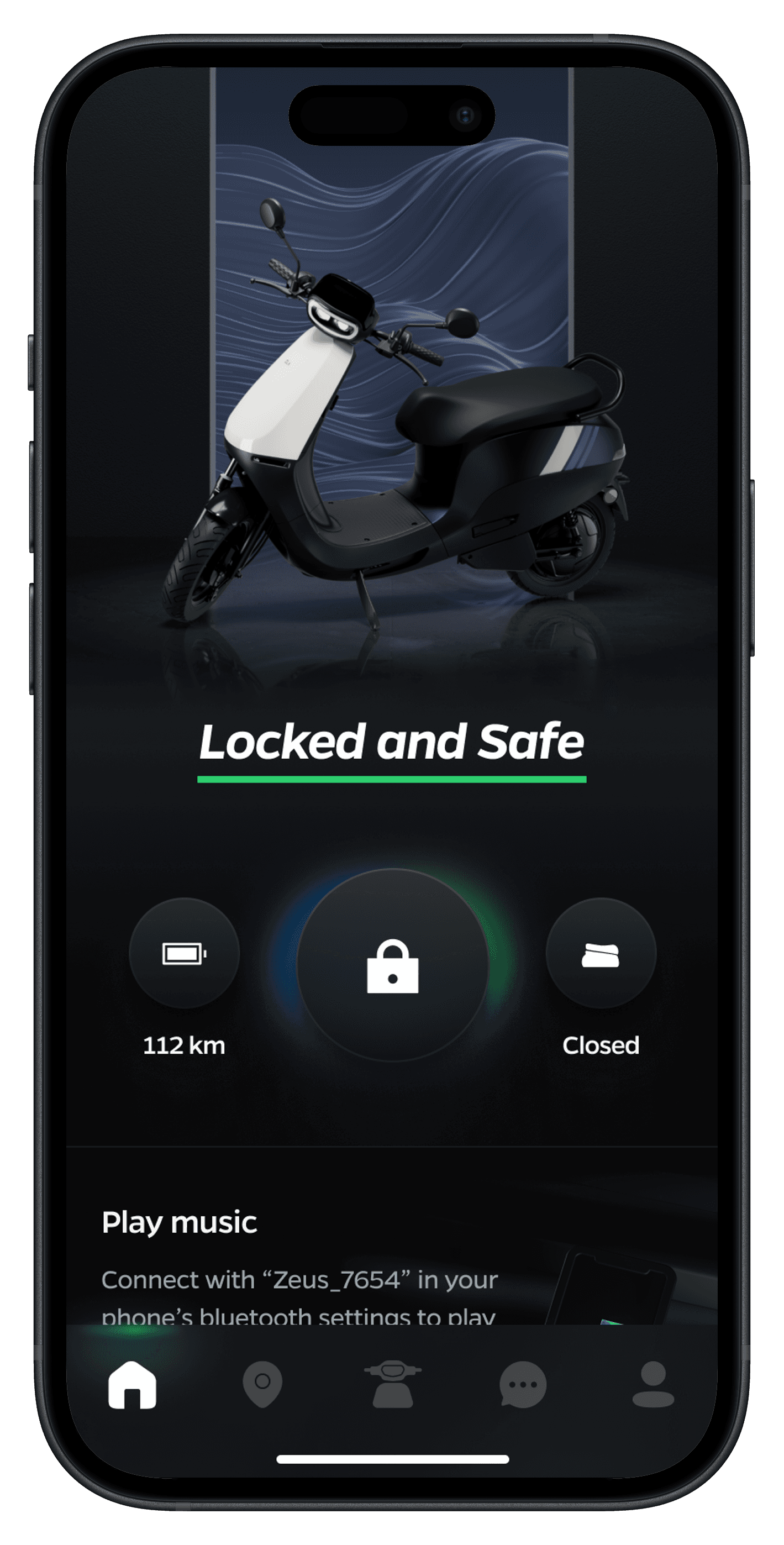
Light and Dark Mode UI Elements
Light and Dark Mode UI Elements


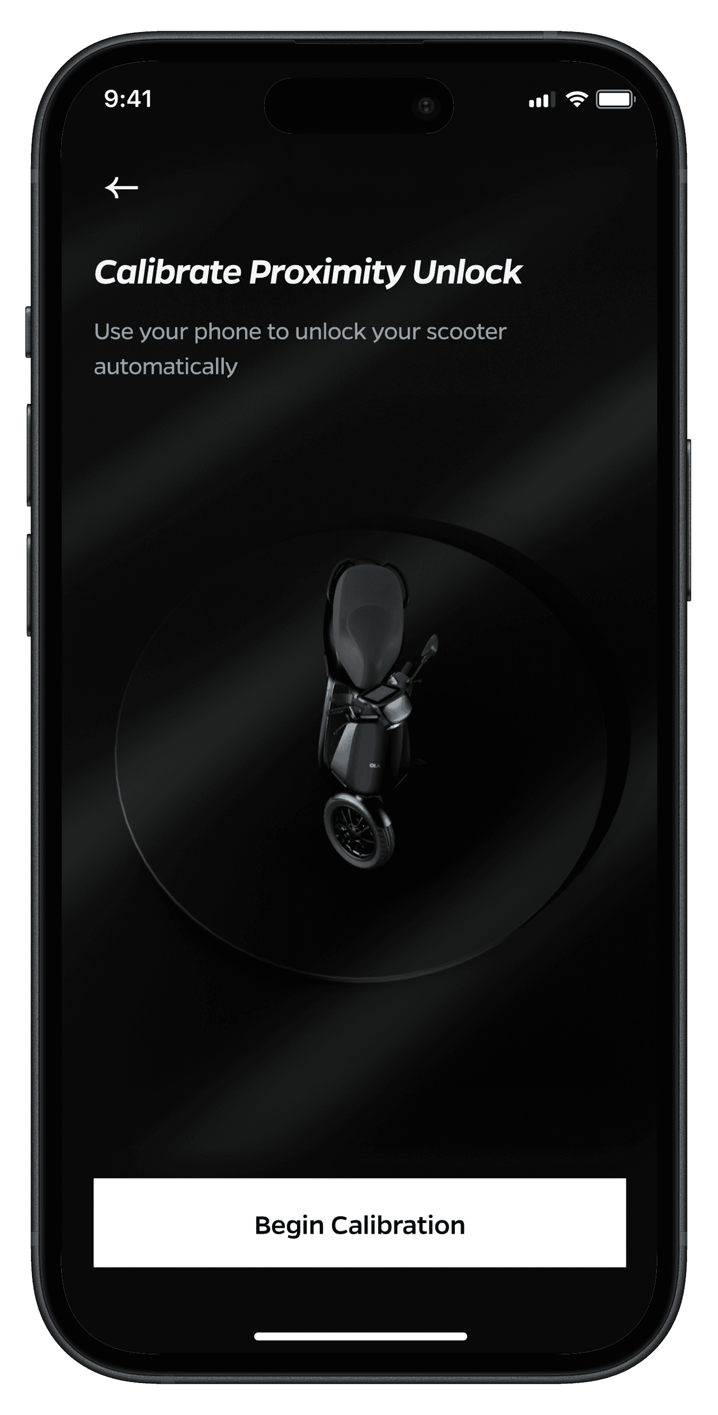

Home Screen Explorations
The Result
The Result
Device Efficiency
Battery Optimisation
Feature Utilization
User Satisfaction
Increased Engagement
Brand Perception
Device Efficiency
User Satisfaction
Battery Optimisation
Increased Engagement
Feature Utilization
Brand Perception
The dark mode redesign was successfully launched, receiving enthusiastic feedback from users and stakeholders alike. The project yielded numerous positive outcomes that extended beyond mere aesthetics, demonstrating the power of thoughtful design in driving user engagement and business value. By carefully considering user needs and leveraging the latest design trends, we were able to create a dark mode experience that not only met but exceeded user expectations. The impact of this redesign was felt across multiple facets of the business, from user satisfaction and engagement metrics to brand perception and operational efficiency.
The dark mode redesign was successfully launched, receiving enthusiastic feedback from users and stakeholders alike. The project yielded numerous positive outcomes that extended beyond mere aesthetics, demonstrating the power of thoughtful design in driving user engagement and business value. By carefully considering user needs and leveraging the latest design trends, we were able to create a dark mode experience that not only met but exceeded user expectations. The impact of this redesign was felt across multiple facets of the business, from user satisfaction and engagement metrics to brand perception and operational efficiency.
Improved User Satisfaction
Improved User Satisfaction
32%
32%
Increase in app satisfaction score
Increase in app satisfaction score
User Patterns
User Patterns
74%
74%
Users permanently stick to Dark Mode
Users permanently stick to Dark Mode
Elevated Brand Perception
Elevated Brand Perception
19%
19%
Increase in social media mentions
Increase in social media mentions
Enhanced Device Efficiency
Enhanced Device Efficiency
17%
17%
Longer battery life
Longer battery life
Feature Discovery Boost
Feature Discovery Boost
19%
19%
Users exploring underused features
Users exploring underused features
Increased Engagement
Increased Engagement
27%
27%
Rise in user engagement during evening hours
Rise in user engagement during evening hours
The Process
The Process
The process for our dark mode redesign focused on maintaining brand consistency while creating an intuitive and visually appealing dark interface that would enhance user experience in low-light conditions.
The process for our dark mode redesign focused on maintaining brand consistency while creating an intuitive and visually appealing dark interface that would enhance user experience in low-light conditions.
Research & Discovery
Research & Discovery
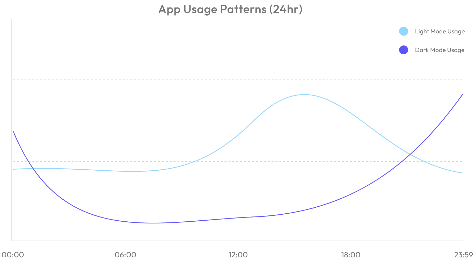
Analyzed existing app usage patterns during different times of day
Conducted user research on nighttime app usage behaviors
Identified key pain points with bright interface in low-light conditions
Researched dark mode implementation best practices
Analyzed battery consumption patterns on OLED devices
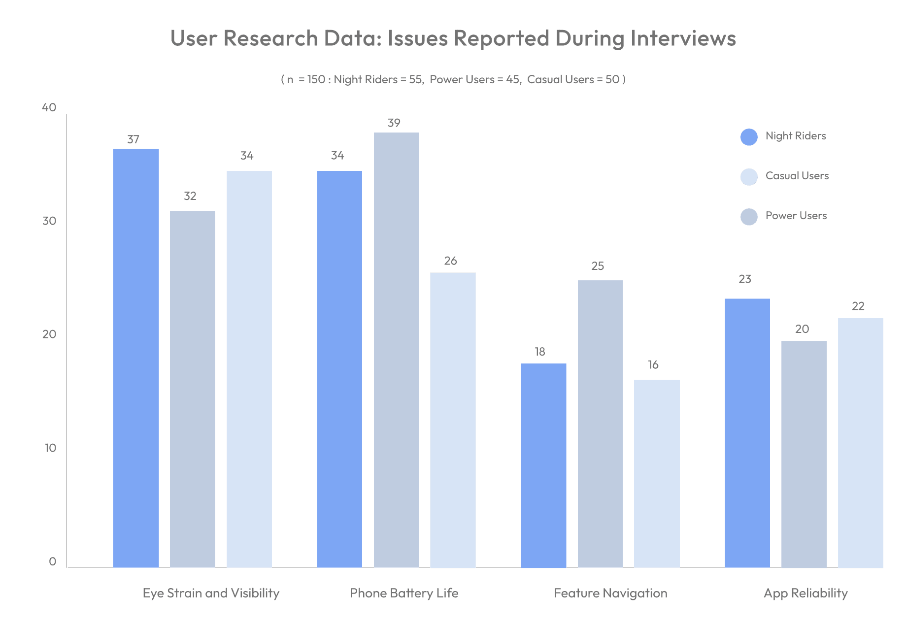
User Research Data: Issues Reported During Interviews
( n = 150 : Night Riders = 55, Power Users = 45, Casual Users = 50 )
40
30
20
10
0
Eye Strain and Visibility
Phone Battery Life
Feature Navigation
App Reliability
37
32
34
34
39
26
18
25
16
23
20
22
Night Riders
Casual Users
Power Users
User Personas
User Personas
Night Rider
Night Rider
Pain Points
Pain Points
Eye strain from bright interface at night
Battery drain during long shifts
Difficulty reading stats in low light
Screen glare issues while riding
Eye strain from bright interface at night
Battery drain during long shifts
Difficulty reading stats in low light
Screen glare issues while riding
Goals
Goals
Reduce eye strain during night rides
Extend phone battery life
Access information quickly
Maintain night vision while checking app
Reduce eye strain during night rides
Extend phone battery life
Access information quickly
Maintain night vision while checking app
Power User
Power User
Pain Points
Pain Points
Wants UI to match system preferences
Finds bright interface harsh in dark environments
Needs clear visual hierarchy
Concerned about OLED screen burn-in
Wants UI to match system preferences
Finds bright interface harsh in dark environments
Needs clear visual hierarchy
Concerned about OLED screen burn-in
Goals
Goals
Seamless light/dark mode switching
Consistent brand experience
Enhanced readability
Battery optimization
Seamless light/dark mode switching
Consistent brand experience
Enhanced readability
Battery optimization
Casual User
Casual User
Pain Points
Pain Points
Confused by interface changes
Struggles with contrast in different lighting
Needs obvious interactive elements
Overwhelmed by complex transitions
Confused by interface changes
Struggles with contrast in different lighting
Needs obvious interactive elements
Overwhelmed by complex transitions
Goals
Goals
Maintain familiar interface elements
Clear feature recognition
Simple mode switching
Easy-to-read text and icons
Maintain familiar interface elements
Clear feature recognition
Simple mode switching
Easy-to-read text and icons
User Stories & Scenarios
Daily Usage Patterns
“I want the app to match my system preferences”
Daily Usage Patterns
“I want the app to match my system preferences”
Daily Usage Patterns
“I want the app to match my system preferences”
Visual Comfort
“I want reduced eye strain during night time usage”
Visual Comfort
“I want reduced eye strain during night time usage”
Visual Comfort
“I want reduced eye strain during night time usage”
Daily Usage Patterns
“I want to check my stats without being blinded by brightness”
Daily Usage Patterns
“I want to check my stats without being blinded by brightness”
Daily Usage Patterns
“I want to check my stats without being blinded by brightness”
Feature Recognition
“I want clear visual hierarchy in low light”
Feature Recognition
“I want clear visual hierarchy in low light”
Feature Recognition
“I want clear visual hierarchy in low light”
Visual Comfort
“I want to minimize screen burn-in”
Visual Comfort
“I want to minimize screen burn-in”
Visual Comfort
“I want to minimize screen burn-in”
System Integration
“I want consistent transitions between modes”
System Integration
“I want consistent transitions between modes”
System Integration
“I want an obvious way to switch between modes”
System Integration
“I want an obvious way to switch between modes”
System Integration
“I want an obvious way to switch between modes”
System Integration
“I want automatic dark mode based on system settings”
System Integration
“I want automatic dark mode based on system settings”
Visual Comfort
“I want to preserve my night vision while using the app"
Visual Comfort
“I want to preserve my night vision while using the app"
Daily Usage Patterns
“I want the app to match my system preferences”
Daily Usage Patterns
“I want the app to match my system preferences”
Daily Usage Patterns
“I want the app to match my system preferences”
Feature Recognition
“ I want familiar elements to remain recognizable”
Feature Recognition
“ I want familiar elements to remain recognizable”
Feature Recognition
“ I want to easily identify features in both modes”
Design Iterations
Design Iterations
Color Palette
Color Palette
Brand-Focused
Brand-Focused
Direct color inversions
Strict brand guidelines
Limited contrast options
Standard dark mode colors
Direct color inversions
Strict brand guidelines
Limited contrast options
Standard dark mode colors
Accessibility-Focused
Accessibility-Focused
High contrast ratios
Readability prioritized
Multiple gray scales
Enhanced visual hierarchy
High contrast ratios
Readability prioritized
Multiple gray scales
Enhanced visual hierarchy
Hybrid Approach
Hybrid Approach
Brand colors with dark optimization
Balanced contrast levels
Thoughtful color mapping
Brand colors with dark optimization
Balanced contrast levels
Thoughtful color mapping
UI Elements
Conservative
Conservative
Simple inversions
Minimal changes
Basic transitions
Standard components
Simple inversions
Minimal changes
Basic transitions
Standard components
Experimental
Experimental
New dark patterns
Custom components
Complex animations
Unique interactions
New dark patterns
Custom components
Complex animations
Unique interactions
Balanced
Balanced
Optimized standard elements
Refined interactions
Smooth transitions
Optimized standard elements
Refined interactions
Smooth transitions
Interaction Design
Minimal
Minimal
Basic mode toggle
Simple transitions
Standard feedback
Limited animations
Basic mode toggle
Simple transitions
Standard feedback
Limited animations
Enhanced
Enhanced
Gesture-based switching
Complex transitions
Rich feedback
Dynamic animations
Gesture-based switching
Complex transitions
Rich feedback
Dynamic animations
Design Decision Matrix
Design Decision Matrix
High Impact / Easy Implementation
High Impact / Easy Implementation
Basic dark mode toggle
Simple color inversions
Essential contrast adjustments
Basic transition animations
Basic dark mode toggle
Simple color inversions
Essential contrast adjustments
Basic transition animations
Low Impact / Easy Implementation
Low Impact / Easy Implementation
Basic feedback indicators
Simple icon adjustments
Standard dark mode patterns
Basic preference settings
Basic feedback indicators
Simple icon adjustments
Standard dark mode patterns
Basic preference settings
High Impact / Complex Implementation
High Impact / Complex Implementation
System-integrated theme switching
Context-aware color adaptation
Advanced OLED optimizations
Seamless mode transitions
System-integrated theme switching
Context-aware color adaptation
Advanced OLED optimizations
Seamless mode transitions
Low Impact / Complex Implementation
Low Impact / Complex Implementation
Complex animation systems
Advanced customization options
Detailed transition effects
Multiple theme variations
Complex animation systems
Advanced customization options
Detailed transition effects
Multiple theme variations
Iteration Feedback Highlights
Iteration Feedback Highlights
Key User Feedback:
Key User Feedback:
"Need clearer distinction between interactive elements"
"Want smoother transitions between modes"
"Battery life significantly improved"
"Better readability at night"
"Appreciate maintained brand identity"
"Need clearer distinction between interactive elements"
"Want smoother transitions between modes"
"Battery life significantly improved"
"Better readability at night"
"Appreciate maintained brand identity"
Implementation Priorities:
Implementation Priorities:
Enhanced interactive element contrast
Refined mode transition animations
OLED screen optimizations
Improved text legibility
Consistent brand elements
Enhanced interactive element contrast
Refined mode transition animations
OLED screen optimizations
Improved text legibility
Consistent brand elements
Final Design Direction
Final Design Direction
Based on user feedback and testing, we chose to pursue:
Based on user feedback and testing, we chose to pursue:
Hybrid color palette approach
Hybrid color palette approach
System-integrated theme switching
System-integrated theme switching
Optimized UI elements for both modes
Optimized UI elements for both modes
Smooth transition animations
Smooth transition animations
Context-aware contrast adjustments
Context-aware contrast adjustments
This direction balances user needs, technical constraints, and brand requirements while delivering an optimal dark mode experience for all user types.
This direction balances user needs, technical constraints, and brand requirements while delivering an optimal dark mode experience for all user types.
connect.
Don’t be shy...say hi !
Always up for fun collaborations, gigs and meeting over a pint !
Usually in Mumbai or Bangalore.
connect.
Don’t be shy...say hi !
Always up for fun collaborations, gigs and meeting over a pint !
Usually in Mumbai or Bangalore.